Warm White or Cool White? Comparing Undertones on a Wall
Compare warm white or cool white paint beside your floors, trim, and fabrics so you can choose a wall color that belongs with the room.
The most common mistake with warm white or cool white paint is choosing from a tiny chip held alone against a white page. The cost is a wall that makes the floor look pink, the trim look gray, or the sofa seem to have changed color overnight. White paint is not an absence of color; its undertone becomes visible through the colors and materials beside it.
What does “warm” or “cool” white mean on a wall?
A warm white leans toward yellow, cream, red, or sometimes a muted peach. A cool white leans toward blue, green, or gray. These are subtle biases, not obvious hues, which is why two white swatches can look nearly identical in a store and distinctly different at home.
Paint names offer clues but not reliable classifications. “Cotton,” “cloud,” and “snow” are marketing language, not a shared color system. Look at the actual sample, and compare it with a neutral white reference if useful; do not assume that the word “warm” on a label describes how it will read beside your particular oak floor.
Undertone is also relational. A creamy white beside honey-colored wood may appear balanced, while the same paint beside blue-gray tile can look conspicuously yellow. A cool white beside crisp white trim may seem clean; beside a warm stone countertop, it may make the stone look muddy.
Which white fits the materials already in the room?
Start with the surfaces that will remain. Paint should make sense with the largest or most visually assertive fixed materials, rather than forcing every object to agree with it.
- Honey oak, maple, or warm brick: Try a warm white if you want the wall and wood to read as a related palette. A very blue-white can sharpen the contrast and make the wood look more orange.
- Cool gray stone, blue tile, or charcoal finishes: A neutral-to-cool white may sit more comfortably. A strongly creamy white can make gray surfaces appear colder by comparison.
- Mixed woods and metals: Look for a restrained, near-neutral white. It can act as a middle ground, though the room’s dominant material should still guide the choice.
- White cabinetry or trim that will stay: Compare the proposed wall color directly with it. Two whites can differ enough that the trim appears yellow, blue, or simply dirty, even when both are attractive on their own.
These are starting points, not rules. If a room has a prominent rug or sofa in a strong color, include that in the comparison. A wall color that harmonizes with the floor but argues with the largest upholstered surface has not solved much.
How should you judge paint samples together?
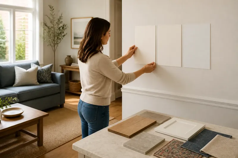
Do not compare a candidate only against a small paint-card border. Make large sample boards from white poster board or primed foam board, and apply the paint with the finish you are considering. A generous, movable sample gives you room to see the undertone without the surrounding card color doing the talking.
- Gather the fixed finishes and the major movable colors: a flooring sample or clear floor view, countertop, cabinet door, upholstery swatch, rug, and existing trim.
- Place two or three candidate boards near one another, then set the materials directly beside each board. Keep the samples vertical, since a wall is not a tabletop.
- Move the boards to more than one wall. A sample beside a window may look different from one on the wall across the room, and a shaded corner can reveal a color cast the sunny wall conceals.
- Look at the group in the room’s ordinary lighting conditions at different points in the day. If lamps are used in the evening, view the samples under those lamps as well.
- Choose the sample that makes the important neighboring materials look intentional, not the one that looks most appealing by itself.
Say you have amber oak flooring, a blue-gray sofa, and white trim that cannot be repainted. Imagine placing a warm-white board beside the floor and trim, then a cooler board in the same position. If the warm sample makes the trim look dingy, while the cool sample makes the floor look unusually orange, a softer neutral may be the better compromise; the observable result to look for is a coherent grouping, not a perfect match.
Does the room’s light change which undertone works?
Yes, but daylight direction is only one part of the picture. The color of nearby surfaces, the amount of shade, and the lamps used after dark all influence how a white appears. A north-facing room may make some whites feel cooler, while warm-toned lamps can push them toward cream; neither effect means the paint itself has changed.
Check samples where the wall will actually be seen, rather than choosing from a single bright patch. A wall opposite a window may receive reflected color from a garden, brick exterior, or neighboring building. In a room with several windows, compare more than one wall because the incoming light and reflections may not be alike.
Also consider the room’s use. A kitchen with warm wood and creamy stone may benefit from a white that feels quiet beside those finishes. A room with crisp white trim and cool gray textiles may call for a cleaner, cooler wall white. The point is not to classify the room by compass direction, but to see which combination remains agreeable under its usual light.
Which white fits your situation?
Choose warm white when: the room’s fixed finishes are mostly warm, the desired effect is soft rather than crisp, and the trim or cabinetry does not turn visibly dull beside the sample. It is often the natural companion to warm woods and earthy finishes.
Choose cool white when: the room has cool stone, blue-gray textiles, or crisp white details, and a warmer sample looks yellow beside them. It can give a clean contrast, provided that contrast does not make the wood or other warm elements seem more orange than you like.
Choose a near-neutral white when: the room mixes warm and cool finishes, or neither warm nor cool samples make the important materials look settled. This is not a magic compromise that erases conflict; test it against the pieces that matter most and accept that one element may remain more noticeable than another.
Reconsider white when: every sample looks stark, muddy, or oddly colored beside the room’s finishes. A pale cream, gray, or other restrained tint may relate more naturally to the materials than a white that is being asked to solve an impossible group project.
What should you check before choosing a white paint?
Should white walls match white trim?
They do not have to match, but the difference should look deliberate. Put the wall sample beside the actual trim; if the trim suddenly appears yellow or gray in a way you dislike, choose a closer undertone or a clearer contrast.
Can a warm white work with gray floors?
It can if the gray has a warm or neutral cast and the rest of the room supports the pairing. Compare the paint beside the floor and the largest furnishings rather than deciding from the floor color alone.
How large should a paint sample be?
Use a board large enough to show a clear field of color without being dominated by its edges. A movable board also lets you compare the same paint on different walls without painting over a large area before you have chosen.
Should I decide by the paint name or the sample?
Decide by the sample in the room. Names can help you shortlist colors, but they cannot account for the floor, trim, furnishings, and light that will sit around the paint.
What is not worth the effort?
There is little value in ranking every white card in a fan deck under store lighting, or in trying to identify an undertone from the name alone. Nor does every small object need to be brought into the comparison. Concentrate on fixed finishes, trim, and the largest furnishings; a decorative bowl can remain uninvolved.
When checking product labels, follow the manufacturer’s directions for sampling and paint application; the appropriate preparation and finish depend on the product and surface.
For warm white or cool white paint, the useful decision is the one made beside the room’s real materials, in the room’s real light. Keep the strongest fixed finishes in view, compare samples as a group, and choose the white that lets those neighbors look like themselves. That is a more dependable standard than finding the whitest white, a pursuit with no known finish line.